Link: Creating a dating app with more effective relationships
Part 1: The Challenge
Background
I did this project as part of a UX bootcamp I enrolled in. The dating app I created for this purpose is called Link, which is a made-up name. The goal of the project was to design a dating app for people in their 30s and 40s who wanted a long-term and committed relationship.
Problem
There are clearly more people using the internet to find romance. As a result, it’s not surprising that business is booming.
It is predicted that there will be 384 million users worldwide in 2023. And over the next five years, those numbers are expected to increase by another hundred million to 440 million.
People invest a lot of time in getting to know a potential partner. But they are often let down in real life when most dating apps tell them the match is ideal. And this is very frustrating.
Only 2% of Internet dates end in a stable relationship.
Scope
For the purpose of designing this app, I used the design thinking process as a basis.
Roles
- UX Research
- Information architecture
- Visual design
- Interaction design
Tools
- Figma
- FigJam
- Photoshop
- Xara Designer Pro
Part 2: The Process
Step 1: Empathize
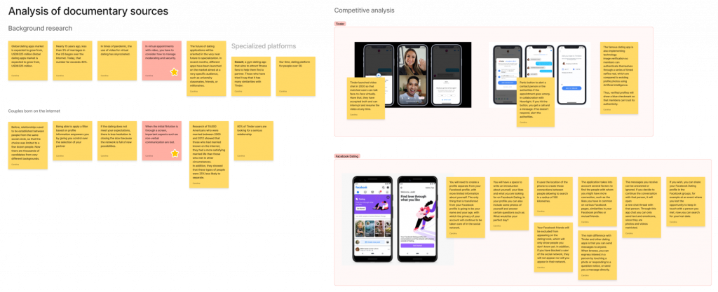
To begin with, I conducted research on the industry and the different types of dating apps that are available on the market today.
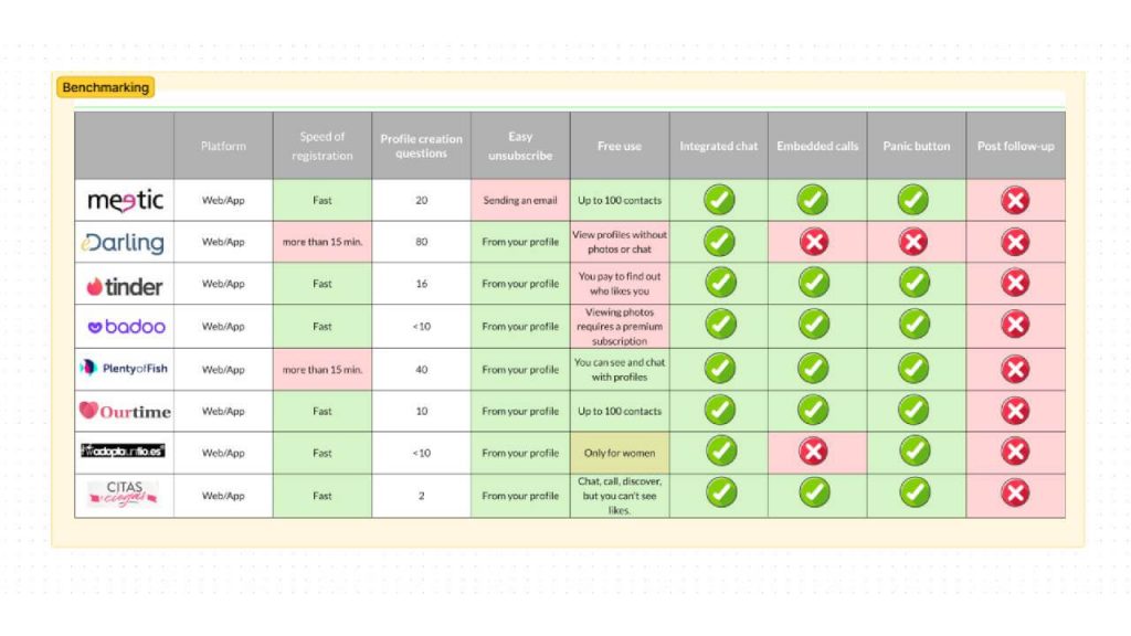
In order to acquire insight into the best practices of a few of the leading dating apps, I then selected eight apps and performed benchmarking to discover their best practices.

To understand the motivations and desires of potential users, I conducted in-depth interviews with ten people who were looking for lasting love online. They were all between 30 and 40 years old and lived in big cities or small urban areas. They also used other dating apps regularly. I customized the surveys for each gender, paying more attention to the safety aspect for women. I explored various topics, such as their profile creation, app usage, goals, payment options, and so on.
Key results
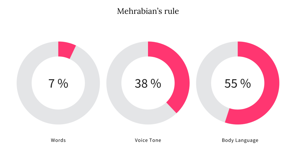
- According to Mehrabian’s rule, a person’s first impression is shaped by their body language (55%), voice tone (38%) and words (7%). However, most apps only let users judge a profile by a photo and a short bio. This means that the first impression on whether to accept or reject a profile is based on a mere 7%. Moreover, some apps only allow video calls after a match has been made.
- The interviews revealed that disappointment occurs at the time of the date. Furthermore, the research showed that less than a third of the first dates lead to a second one. This suggests that what the user finds in the app does not match what happens outside of it.
The analysis of eight dating apps and their features revealed that not all of them allow video calls, and none of them follow up after the date, which have been identified as points to consider for the design of a new dating app in order to gain a competitive edge.
Step 2: Define
Personas
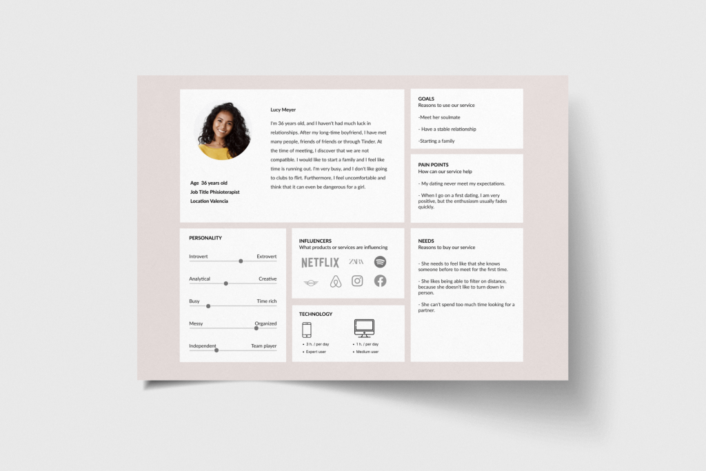
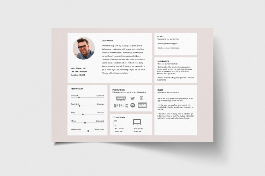
My research led me to create two personas that guided me throughout the whole product development process. I crafted realistic scenarios for each persona that captured their goals and needs when using the app. This helped me to design better solutions that addressed the pain points and behaviors of each persona, as well as how they engage with this kind of app.
Customer Journey Map


The context of each persona’s interaction was my focus to grasp the user’s mood during the interaction. This aided me greatly in creating important design decisions and key features.
Step 3: Ideate
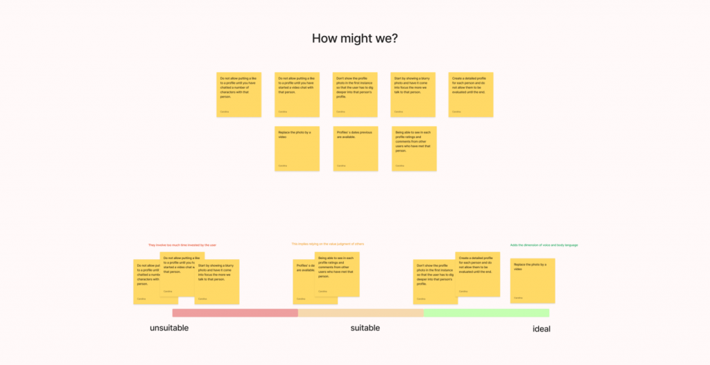
I used the Brain Netting technique to facilitate a remote brainstorming session with other participants using virtual tools. I applied the “How we might? technique in order to generate more positive and innovative solutions.
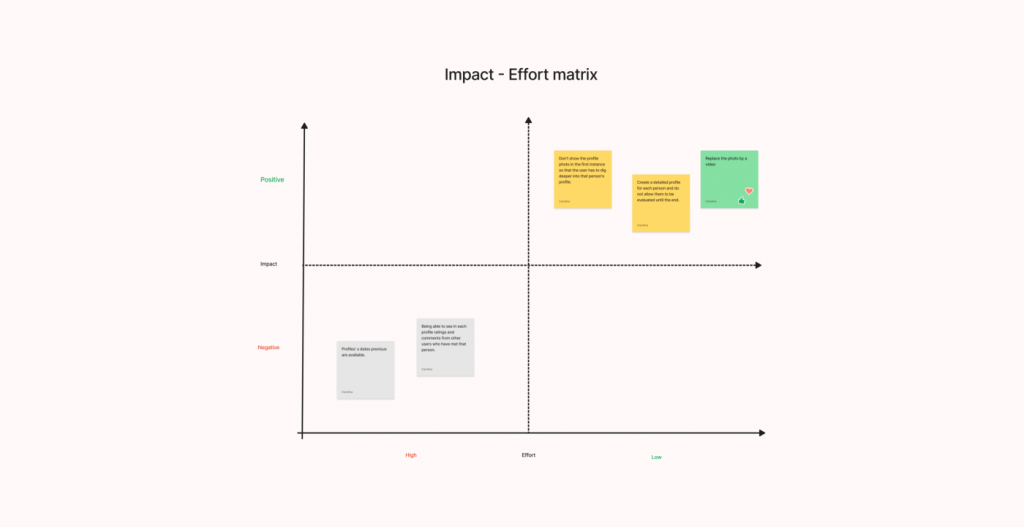
After generating the initial ideas, I used an impact-effort matrix to prioritize them. This tool helps to evaluate the ideas based on two criteria: the impact they have on the user or the business, and the effort required to implement them.
Here are some of the main ideas that emerged:
- Creating a more detailed profile for each person.
- Removing the profile picture and using a short video instead.
- Develop a survey that will be sent at the end of each date.
By paying attention to the situational factors of each persona, I could grasp the emotional state of the user during the interaction. This helped me a lot in making important design choices and key features.
Sitemap

Step 4: Prototype
Low-fidelity wireframes

Mid-fidelity wireframes
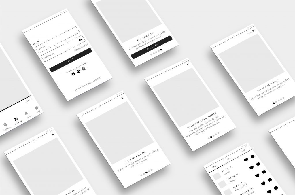
Based on my sketches, I built a black-and-white prototype. I laid out all the visual UI elements, created a hierarchy, and applied design patterns to spot pain points early on.
I used Figma to design 44 screens, covering a splash screen, onboarding, login, a profile’s gallery, a candidate profile, my list of likes, my list of dates, details of date, and a feedback form.
Part 3: The Solution
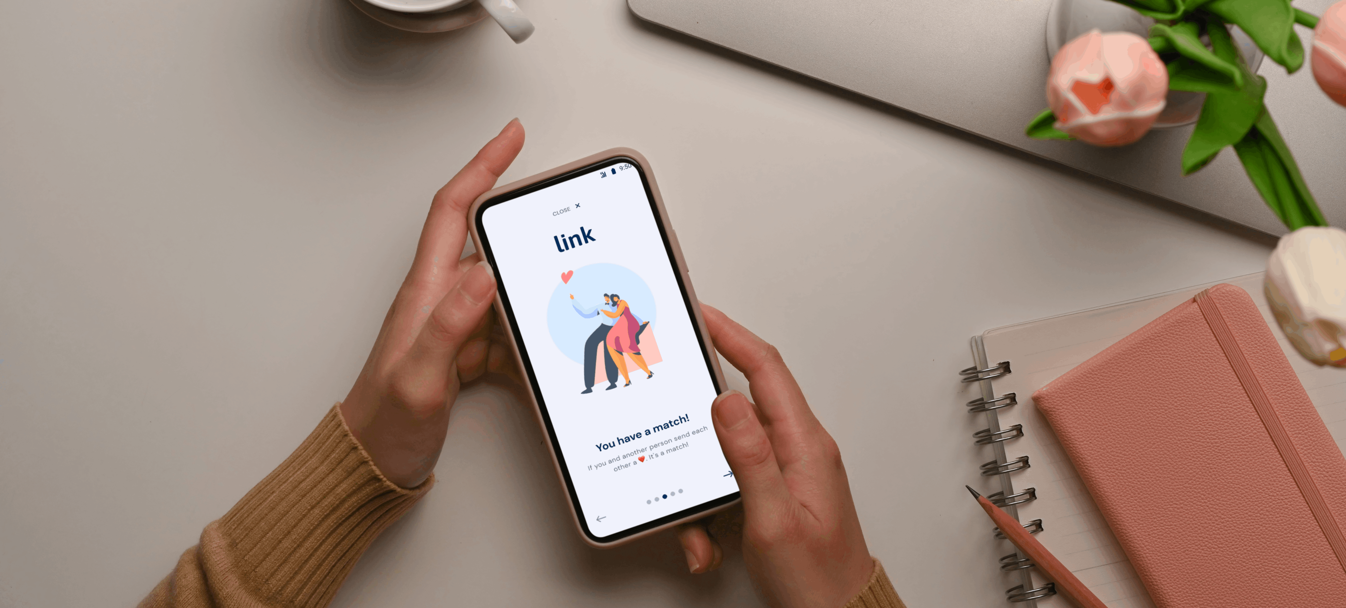
After more iterations, I finalized the screens and interactive prototype with Figma as well. My design goal was to create a sleek, modern look that would help users reach their goals faster. Link is a dating app that offers stable relationships, so the survey screens after a date were key.
I used elegant and simple illustrations and icons to keep the look modern and fresh.
Closing Reflections
Designing the Link app was such a positive learning experience. Starting from research to high-fidelity prototypes taught me so much about the user-centred design process.
The research process was crucial. After researching competitors and the market, I discovered features that similar apps had overlooked and linked these to personas’ pain points. As a result, Link gained a competitive advantage.
On the other hand, creating personas is a powerful tool, knowing the needs and pain points of the users enabled me to build fluid experiences and have them present in each stage of the process.