Panama Jack: Redesigning the Website of an Iconic Footwear Brand
Part 1: The Challenge
Background
In 1973, at just 23 years old, Antonio Vicente began his career in the footwear sector in Elche, Spain. In his first workshop, known as ‘La Casita’, he began to carve out the history of this great company.
However, it was not until 1989 that the famous logo was stamped on their boots for the first time, making the Panama boots an emblem of the brand. This company, which was born and grew to support local production, now exports to 22 countries. Their products stand out for their quality, durability, and comfort. Its timeless design is aimed at an audience seeking challenges. That is why it is said that walking with Panama Jack means being part of the story of people who strive to make their dreams come true and make their lives an adventure.
Problem

I always enjoy learning about the history of products that I like, and I am excited to see how a dream becomes a reality. However, when I visited the Panama Jack website, I found it lacking in emotion.
The product visualization is complex, overloaded with information, and lacks stylistic consistency. As a whole, the website does not reflect the high quality of its products.
E-commerce is evolving, and so are consumers. After groceries and clothing, footwear is the third most popular category in online shopping. The website should focus more on enhancing the user experience. This has led me to choose Panama Jack as my new case study subject.
Note: The purpose of this unsolicited case study is to acquire knowledge, propose new ideas for improving an already excellent product, and gain fresh insights.
Scope
I redesigned the home page of the Panama Jack website for this case study and also extended it to the internal structure, mainly in the presentation of the products.
Roles
- UI/UX Research
- Information architecture
- Data analyst
- Product designer
Tools
- Figma
- FigJam
- Photoshop
- Xara Designer Pro
- WhatFont
- Semrush
- Seoptimer
Copyright
All photos included in my design are copyrights of Panama Jack.
Part 2: The Process
Step 1: Empathize
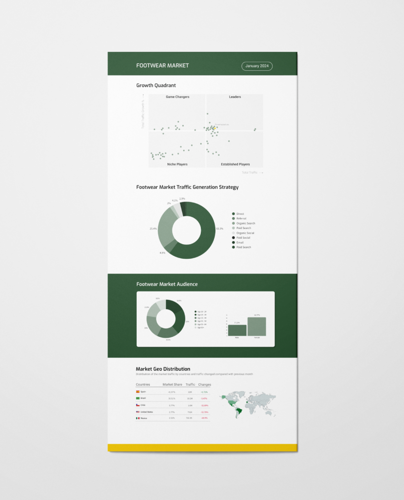
- The Growth Quadrant summarizes the competitive landscape of the footwear market, indicating the position of each competitor. In the diagram, Panama Jack is identified as one of the market ‘leaders.’ This signifies that the brand not only enjoys a high volume of website traffic but also continues to grow at a rapid rate compared to the market average.
- According to Semrush, another noteworthy data point is that the total traffic for all market domains over the selected period was 28.6 million, with Panama Jack capturing 1.02% of it.
- Furthermore, the most significant channels in the market are depicted in the Traffic Generation Strategy. This donut chart illustrates the amount of traffic generated by each channel, with direct traffic and organic search leading the way.
- The Audience section provides a basic breakdown of the market audience demographics. It reveals that the female segment is larger than the male segment in the footwear market. Specifically, the age groups of 25–34, 35-44, and 45-54 are the most significant.
- Lastly, the Market Geo Distribution section displays the top five countries with the largest audience globally for the specified period. These countries, which contribute the most visitors to the footwear market, are Spain, Brazil, Chile, the United States of America, and Mexico.
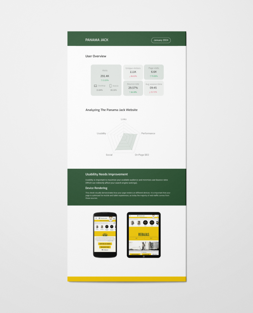
- Upon analyzing the Panama Jack website for the specified period, it was observed that 80.16% of the visits originated from mobile devices. While the SEO performance is yielding very good results, it is noted that usability needs enhancement, considering that the majority of e-commerce transactions are now conducted on these devices.
Step 2: Define
Personas
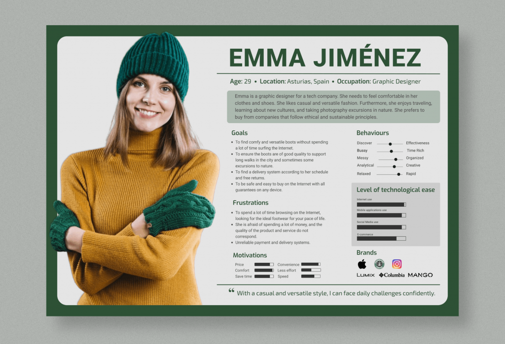
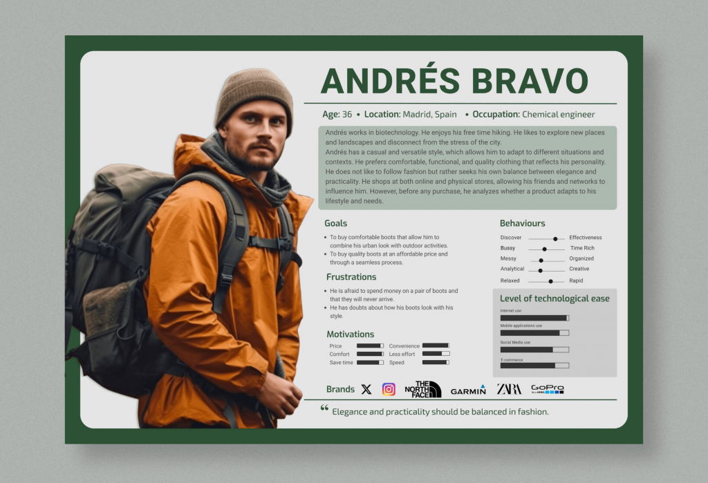
Due to a lack of detailed information about users, I created two personas to serve as the foundation for my design.
If this were a real project, I would use these assumed personas as working models, validate them with additional data as it becomes available, and refine them as I learn more about the users’ needs.
Step 3: Ideate
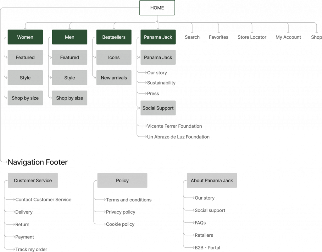
Initially, I had only planned to redesign the homepage, but it was important to understand how users navigated to inner pages from the main navigation, homepage, and footer. As a result, I was able to create an efficient and intuitive sitemap structure based on the needs of my personas.
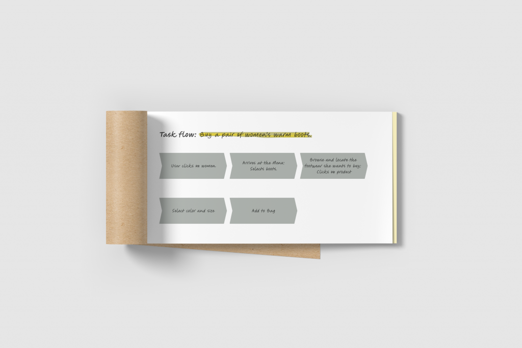
To ensure I had properly thought out the sitemap, I sketched a task flow for tasks that the persona needs to accomplish to buy footwear products. As a result of these sketches, I was able to think through all the tasks and find opportunities to reduce the number of clicks necessary to complete each task in a more efficient manner.
Sitemap
Step 4: Prototype
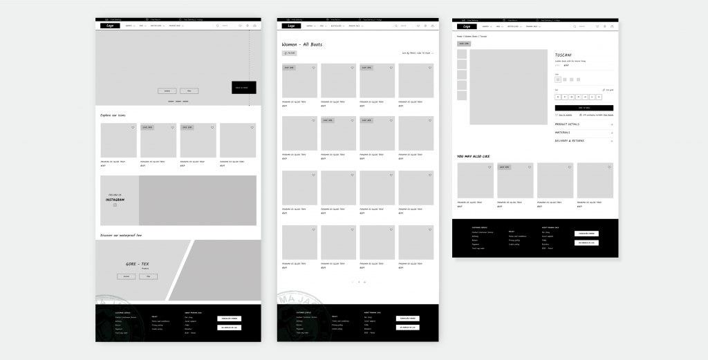
Low-fidelity wireframes
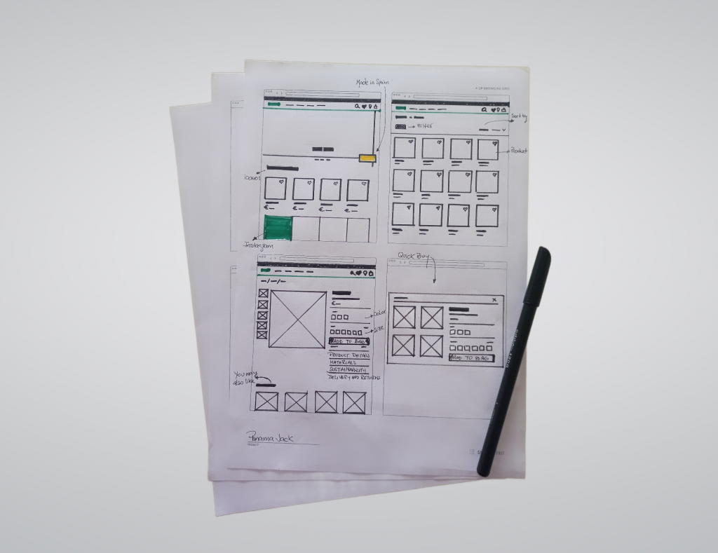
I incorporated paper prototyping into the design thinking stages to ensure that typical users could complete their intended tasks effortlessly. It was also crucial to align the user experience with business goals.
Mid-fidelity wireframes
I developed a low-fidelity wireframe in Figma. The improvements to my initial sketches were based on user testing feedback from the paper prototype.
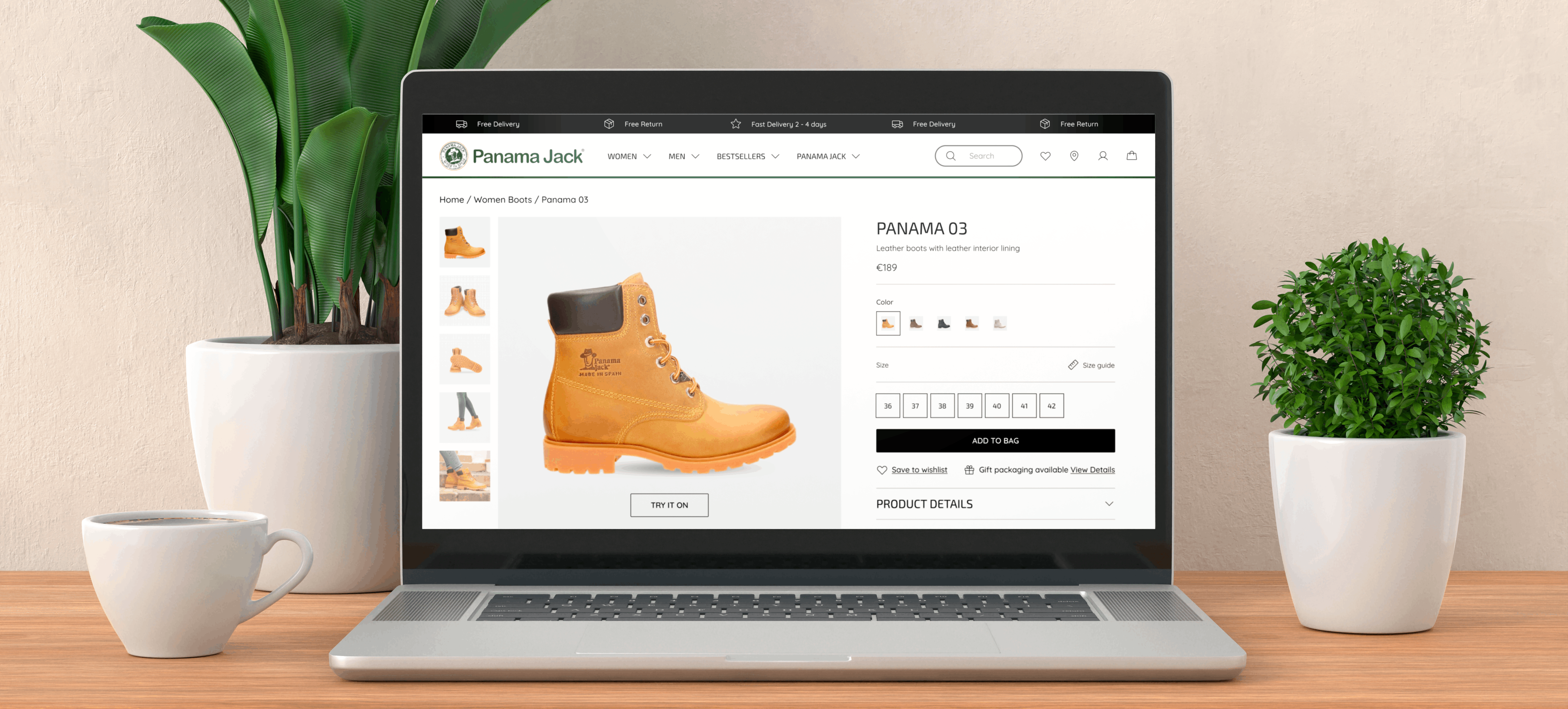
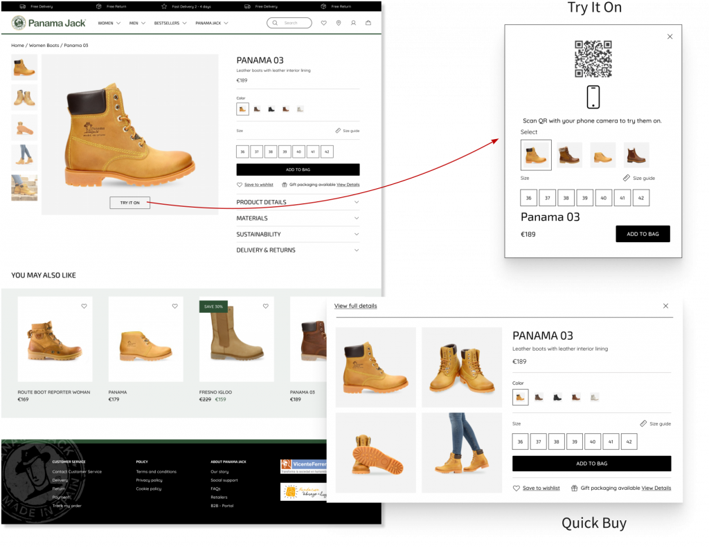
For example, one user indicated a desire for a quicker purchasing process, especially for familiar products. Consequently, I added a “Quick Buy” button to each product listing, which allows users to view essential details for a swift and secure purchase or to opt for more comprehensive information if needed.
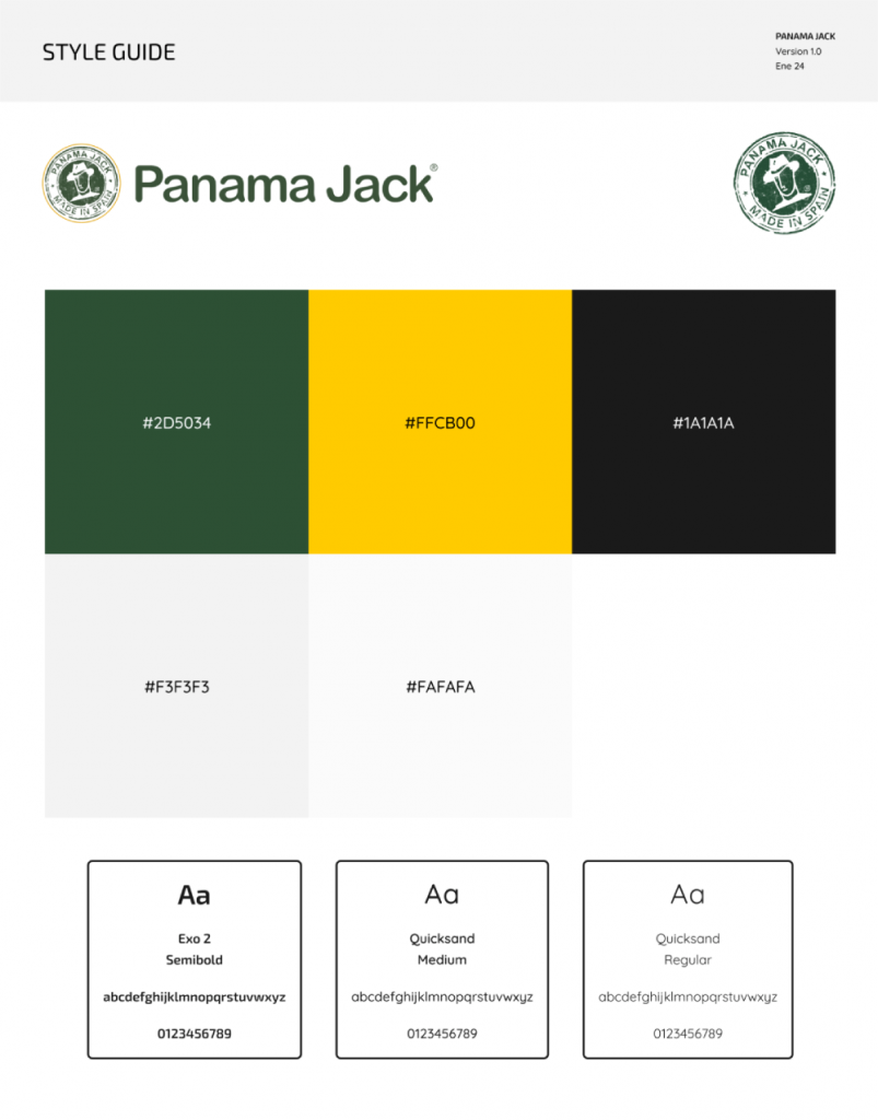
Before moving on to high-fidelity design, I wanted to create a style guide to assist me during the design process. Reviewing the Panama Jack website revealed their primary colors and various fonts. To ensure a consistent design, I selected their main font to maintain brand identity and paired it with a simple, modern font for a complementary look.
Part 3: The Solution
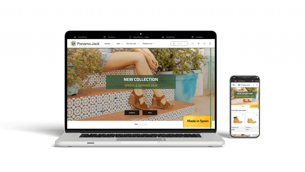
For the high-fidelity design, I sourced images from Panama Jack’s website and Instagram. On the main page, I retained certain elements of the website while redefining others to ensure the transition was not too abrupt. My goal was to develop an effective content strategy that aligned with the project objectives and met the needs of my personas. Additionally, I organized the information to present a neater and more streamlined appearance.
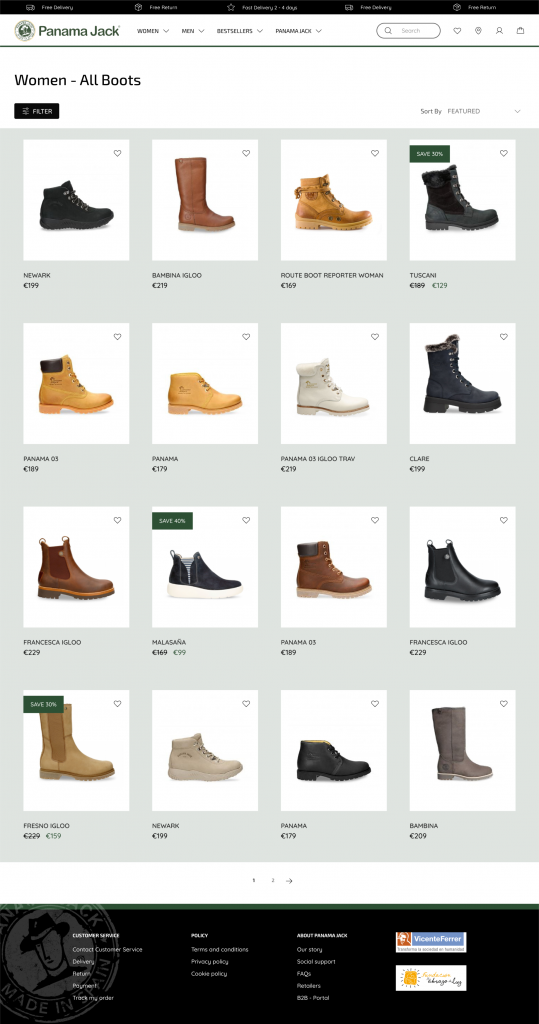
For each product, I added a ‘Quick Purchase’ button that appears when the user hovers over the product image to maintain a clean aesthetic. Clicking this button allows the user to access a concise product summary, with the option to expand for more details if desired. Additionally, the product display includes an augmented reality try-on feature, accessible via a QR code that can be scanned with a mobile device. This feature makes the online product more tangible and enhances the user’s inclination to make a purchase.
To complete this project, I created an interactive prototype that showcases the primary alterations to the website. It is evident that to fulfill all objectives, the personas I devised need further validation through additional qualitative and quantitative data. Nonetheless, the insights obtained from market analysis and user profiles have been instrumental in generating innovative ideas to enhance the user experience for this case study.
Interactive Prototype
Closing Reflections
The iconic Panama boot truly embodies the brand’s spirit, skillfully marrying the excitement of adventure with the elegance of urban style. In my quest to revamp Panama Jack’s digital presence, I delved into the intricacies of their website’s user experience, which, until now, has not mirrored the excellent quality of their products.
My exploratory journey yielded profound insights and allowed me to experiment with innovative e-commerce functionalities that could foster a more engaging user interface and interactive.